Smush
Image weight remains one of the most persistent bottlenecks for WordPress sites. Even well-coded themes can feel sluggish when galleries, hero banners, and product photos are delivered at their original size. Smush steps into this gap with a practical toolkit focused on reducing payload without breaking visuals. It’s not a magic wand, but used well it can dramatically improve site performance, user experience, and indirectly the signals that search engines watch. Below you’ll find a deep, hands-on look at how Smush works, what it does best, where it fits in a modern stack, and why it’s become a trusted companion for site owners whose images are more of a burden than a blessing.
Smush at a glance: what it does and why it matters
Smush is a WordPress plugin from WPMU DEV designed to minimize image bloat through smart compression, resizing, and delivery options. Its core value is straightforward: it reduces file size while protecting visual quality, pushes non-critical media to load later, and helps you serve the right dimensions to the right device. Those moves together reduce total kilobytes shipped to the browser, which lowers time to first render and accelerates scrolling. That small-sounding shift often translates to better engagement, more conversions, and a measurable uplift in page-load metrics.
Unlike hand-optimizing files in Photoshop or bulk-running a third-party service and re-uploading, Smush integrates directly with WordPress. It can automatically optimize images as you upload them, bulk-process existing media, and suggest more efficient dimensions for oversized assets already embedded in content. This “always-on” positioning means you get ongoing benefits without adding extra steps to your publishing workflow. For shops and publishers with multiple authors, that matters: you no longer rely on everyone remembering to optimize before upload.
Smush accommodates a wide range of formats commonly used in WordPress (JPEG, PNG, and more) and supports modern delivery patterns. In practice, that means smaller files, smarter optimization choices, and reduced bandwidth delivered in ways that respect design integrity. Most importantly, Smush’s guardrails help you avoid the two usual pitfalls of image work: quality degradation that undermines brand perception and inconsistent sizing that causes layout shifts.
Feature breakdown: the tools that move the needle
Lossless and lossy optimization modes
Smush began with lossless algorithms that remove unseen bloat (EXIF data, unnecessary metadata, and compression inefficiencies) without changing pixels. Over time, it added a higher-compression mode that trims more bytes while carefully preserving perceived quality. Many sites find that the “balanced” settings produce a fraction of the original weight with no visible compromise—especially valuable for large hero banners and blog imagery where fidelity is important, but perfection at 400% zoom isn’t.
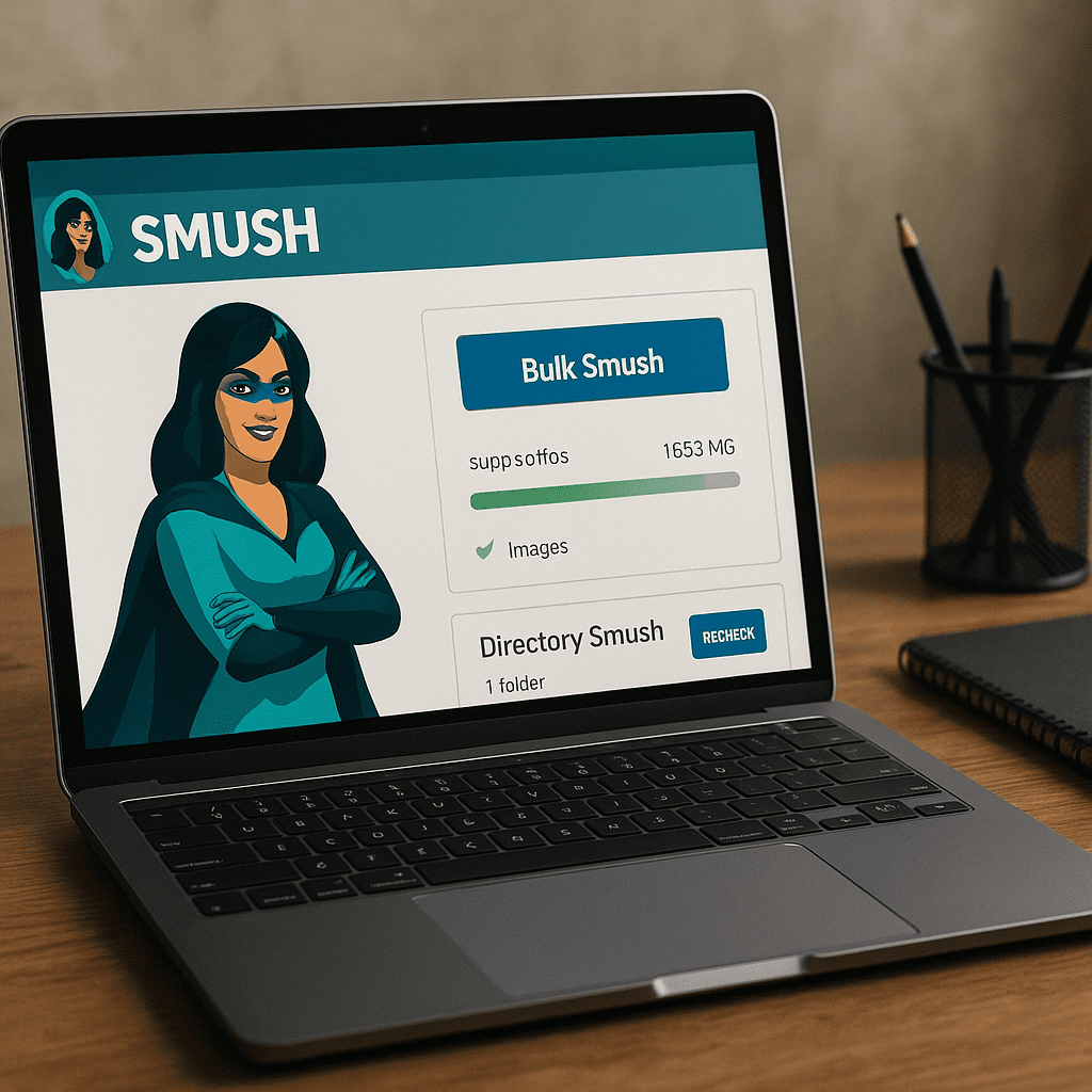
Bulk processing and automatic on-upload compression
The plugin’s bulk optimization lets you sweep through an existing library. For big archives, Smush works in batches to keep server load manageable. Meanwhile, new uploads can be automatically handled so editors don’t have to think about it. Automation is the quiet advantage here: your media library doesn’t backslide into bloat after an initial cleanup.
Resize detection and serve-scaled images
WordPress often generates several thumbnail sizes, but editors sometimes insert larger-than-needed originals into content. Smush flags mismatches—where a 3000px image is being forced into a 700px container—and can help you deliver a right-sized version. This safeguard prevents waste and reduces the risk of janky layout behavior, especially on mobile where oversize downloads are painful.
Lazy loading for offscreen media
Smush can defer rendering of images that aren’t initially visible, a strategy known as lazy loading. This dramatically reduces initial page weight and shortens initial render time, particularly on long posts and product category pages with many thumbnails. It’s an easy win, but with a nuance: you should exclude critical, above-the-fold images (such as your hero banner) so the browser can fetch them immediately. Smush includes controls for exclusions by class, URL pattern, or specific locations.
WebP conversion and modern delivery
Modern formats like WebP can yield substantial savings with near-identical perceived quality compared to JPEG or PNG. Smush offers tooling to convert files and, where configured, serve the converted variant only to browsers that support it while falling back gracefully to legacy formats. This conversion can be handled on your own server or through Smush’s integrated services, with Pro tiers offering more automation and delivery options.
Image CDN for global acceleration
For sites with a global audience, a content delivery network can serve cached assets from geographically closer locations. Smush’s integration with a CDN reduces latency and can dynamically resize images for different viewports. Combined with compression, this keeps your payload lean and snappy across continents, not just in your hosting region.
Directory and external image handling
Beyond the Media Library, Smush can scan and optimize images stored in other directories—useful for theme assets, custom uploads from page builders, or images generated by membership/e-commerce add-ons. This closes a common gap where site owners optimize post images but forget logos, icons, and other UI graphics that load on every page.
Safeguards, rollbacks, and compatibility
Optimization is reversible when you keep original backups, a safety net that makes aggressive settings less scary. Smush’s approach works well with major page builders and recent WordPress versions. It aims to respect retina-ready assets, responsive image attributes (srcset/sizes), and structured markup so your visuals look right on high-density and small screens alike.
Smush and SEO: what actually improves and what doesn’t
Smush is not a keyword or schema plugin; it won’t write titles, add meta descriptions, or build structured data. What it does influence are the technical foundations that search engines increasingly reward: speed, mobile experience, and stability. It helps you shave weight and streamline delivery, which feeds directly into Core Web Vitals—Google’s user-centric performance measurements.
LCP, INP, and CLS: the Vitals that matter
- Largest Contentful Paint (LCP): If your hero image is the main content element, reducing its size and ensuring it is not lazy loaded can yield a clear improvement in LCP. Smush helps by compressing and right-sizing that image, and by letting you exclude it from lazy loading.
- Interaction to Next Paint (INP) and responsiveness: While not directly about images, heavy assets can stall the network and main thread. Smush reduces the bandwidth burden, indirectly helping responsiveness and time to interactive.
- Cumulative Layout Shift (CLS): Serving correctly sized images with explicit dimensions prevents jumpy layouts. Smush’s resize detection and support for responsive attributes help keep CLS stable.
These improvements don’t guarantee higher rankings on their own, but they remove friction for both users and crawlers. Faster pages are crawled more efficiently, and better metrics correlate with increased engagement. In that sense, Smush is a technical ally to your broader SEO strategy, not a replacement for it.
PageSpeed Insights and Lighthouse
Run your site through Google’s tools before and after setting up Smush. You’ll often see warnings such as “Serve images in next-gen formats,” “Properly size images,” or “Defer offscreen images” move into the “Passed audits” column. That visible shift is a practical confirmation that your efforts are paying off. Just remember that lab scores are a proxy; watch field data and user analytics to validate real-world impact.
Accessibility and content semantics
Image optimization doesn’t change alt attributes or captions, which matter for screen readers and contextual clarity. You should still provide descriptive alt text for critical visuals and avoid using images to render text when possible. Smush’s lazy loading incorporates patterns that preserve accessibility while reducing initial load, but content quality remains your responsibility. Treat Smush as an enabler of fast delivery, not a substitute for semantic care.
Setup guide: practical configuration for real-world sites
Initial installation checklist
- Install and activate Smush from the WordPress repository or via your membership account for Pro features.
- Run the setup wizard and accept sensible defaults: automatic compression on upload, lazy loading enabled, basic metadata stripping.
- Enable resize detection and review any warnings about oversize images embedded in your pages or templates.
- Decide whether to store original image backups for rollback. This uses disk space but adds confidence while tuning.
Bulk optimization strategy
For large libraries, optimize in stages. Start with lower compression (lossless or balanced) to cover the bulk safely. Then identify high-impact templates (home, category, product) and consider slightly more aggressive settings for images used there. Monitor visual quality at typical viewing sizes, not at 400% zoom. When changing settings, re-run bulk optimization on a small subset first.
Lazy loading: exclusions and order of operations
Exclude above-the-fold elements like hero sliders and critical banner images from lazy loading to protect LCP. Use Smush’s exclusion tools to target specific classes or IDs used by your theme or builder. Next, confirm that placeholders and aspect ratios preserve layout stability so you don’t introduce CLS by surprise. Finally, validate that any script that swaps images on scroll or hover still works as expected with lazy loading in place.
WebP conversion and delivery
Enable WebP generation and test cross-browser behavior. Ensure there’s a sensible fallback for Safari versions that lack or limit support. If you use cache or security layers (e.g., varnish, reverse proxies, or a third-party CDN), double-check that content negotiation for WebP is respected. On hosting that restricts server modules, consider Smush’s CDN-backed delivery or alternative rewrite strategies.
Image sizes and builder-specific workflows
Page builders can generate and reference custom sizes. After setting your size strategy, regenerate thumbnails so your Media Library aligns with the theme’s and builder’s expectations. If your design uses full-bleed banners, consider creating a dedicated intermediate size (e.g., 1920px wide) so you don’t keep shipping 3000px files to wide screens unnecessarily.
Free vs. Pro: where the value lies
The free tier is a capable baseline: lossless optimization, lazy loading, resize detection, and batch processing with reasonable limits. For many blogs and small business sites, this covers the most important needs without extra cost.
Pro tiers add convenience and depth: more aggressive compression algorithms, automated and broader WebP handling, larger or unlimited bulk queues, and a fully integrated image CDN with on-the-fly resizing. The CDN piece is particularly valuable for international sites or media-heavy catalogs because it pairs format negotiation with edge delivery. If your brand depends on hundreds of product photos or editorial images, the subscription can pay for itself through better conversion and reduced bandwidth.
Smush in the modern stack: how it plays with caching and CDNs
Smush complements caching plugins (page and object caching) and server-level acceleration. A typical stack on a performant host might combine Smush for images, a caching plugin for HTML/CSS/JS minification and page cache, and a DNS-level CDN for static file distribution. When using multiple optimization layers, follow this order of operations:
- Compress and resize assets at the origin (Smush).
- Set cache-control headers and minify where appropriate (caching plugin or server).
- Distribute through a CDN and validate that WebP or responsive variants are cached correctly.
Always purge caches after changing image processing settings. Confirm that edge nodes aren’t serving stale JPEGs when you intended WebP, and that your theme’s srcset outputs align with the sizes you actually generate.
Does Smush ever get in the way?
Any optimization tool can create friction in edge cases. Over-aggressive settings might introduce subtle banding on gradients or soften fine detail in product shots. Lazy loading can delay important visuals if you forget to exclude above-the-fold assets. CDN rewrites may conflict with certain security setups or restrictive hosts. The antidote is careful staging: test on a clone, verify on key breakpoints (mobile portrait, tablet landscape, desktop wide), and recruit a colleague with a calibrated display to spot quality issues you might miss on a laptop.
Alternative plugins and when to consider them
Smush has serious competition, each with its own angle. Some tools emphasize ultra-aggressive compression with perceptual tuning; others focus on full-cloud pipelines that offload all CPU work from your server. If your priority is maximum byte savings at any cost, a dedicated image service may squeeze a little more than Smush. If you need built-in AVIF or exotic format workflows, verify support before committing. That said, Smush’s combination of ease, coverage, and ecosystem support makes it a strong default for most WordPress sites, especially when you want results without a steep learning curve.
My take: balanced, reliable, and friendly to real teams
Smush strikes a pragmatic balance. It’s approachable for non-technical editors, yet powerful enough to satisfy developers who care about quality control and predictable output. It embraces modern conventions—responsive images, next-gen formats, lazy loading—without locking you into brittle rules. On sites where content velocity matters, Smush creates a safety net: contributors can focus on storytelling, and the plugin quietly protects load time and consistency.
From a value perspective, the free tier is generous and fixes the most common issues out of the box. Pro moves the needle further on global delivery and automation. If your site is media-centric, if you sell products with large galleries, or if you publish long posts stuffed with graphics, Smush is an easy recommendation.
Practical tips and small wins you don’t want to miss
- Create a dedicated image size for hero sections so you never ship massive originals to users.
- Exclude logos and icons from heavy compression to avoid banding on flat colors or gradients.
- Use WebP for large photographic content; keep PNG where transparency or line art demands it.
- Enable preloading for the single most important hero image to accelerate LCP.
- When updating theme breakpoints, revisit srcset sizes to ensure the browser picks efficient candidates.
- Measure changes with both lab and field data; PageSpeed Insights plus your analytics platform give a complete picture.
Common pitfalls and how to fix them
- Hero image is lazy loaded, hurting LCP: add its selector to the exclusion list in Smush’s lazy settings.
- WebP not served to all users: confirm server rewrites, caching layers, and CDN settings support content negotiation.
- Image looks soft after compression: roll back using your original, then dial down aggressiveness for that asset type.
- Layout shifts on image load: define width and height, ensure placeholders match aspect ratio, and verify srcset sizing.
- Bulk processing times out: process in smaller batches, increase server timeouts if allowed, and run during low-traffic windows.
- Mixed delivery between CDN and origin: standardize URLs, purge caches, and lock your rules to avoid duplicate variants.
Security, privacy, and governance considerations
Optimization typically involves sending images through processing pipelines. Review what data (if any) leaves your server and where it goes, especially if your site handles sensitive imagery. Smush can strip EXIF metadata (geo-coordinates, camera info) that you might not want to publish. If you rely on embedded EXIF for internal workflows, disable stripping or keep secure originals. Establish a retention policy for original files and ensure team members know where rollbacks live and who has permissions to use them.
Maintenance: keep results consistent over time
As themes evolve and content patterns change, revisit your Smush settings. Audit oversized assets quarterly, check that new builders or blocks produce the sizes you expect, and validate that your Core Web Vitals in field data remain green. Consistency depends on treating image work as part of your content operations, not a one-time cleanup. Smush fits naturally into that rhythm, offering guardrails so your media footprint doesn’t drift upward unnoticed.
Final verdict: a dependable foundation for visual sites
Smush doesn’t try to be everything; it focuses on the fundamentals of image handling and does them well. With smarter formats like WebP, a capable CDN option, careful compression controls, and quality-of-life features like lazy loading and resize detection, it moves the dials that matter without drama. It supports page speed targets, strengthens the technical underpinnings of SEO, and preserves the look and feel your design team worked so hard to craft. If your goal is fast, reliable delivery for media-heavy pages—and you want to achieve it inside WordPress rather than through external juggling—Smush is an excellent choice. Combine it with thoughtful alt text for accessibility, disciplined sizing, and reliable backups, and you’ll have a sustainable media pipeline that scales with your content ambitions.