Browser Resize Tool
Browser Resize Tool is a niche but surprisingly powerful category of software that lets marketers, developers and SEO specialists simulate different screen sizes directly in the browser. Instead of constantly switching between devices, emulators or operating systems, you can quickly check how a website behaves on a wide range of resolutions, aspect ratios and orientations. For anyone responsible for organic visibility, conversion and user experience, this type of tool is far more than a visual gadget: it has a direct impact on how search engines interpret your site and how real users interact with it.
What is a Browser Resize Tool and how does it work?
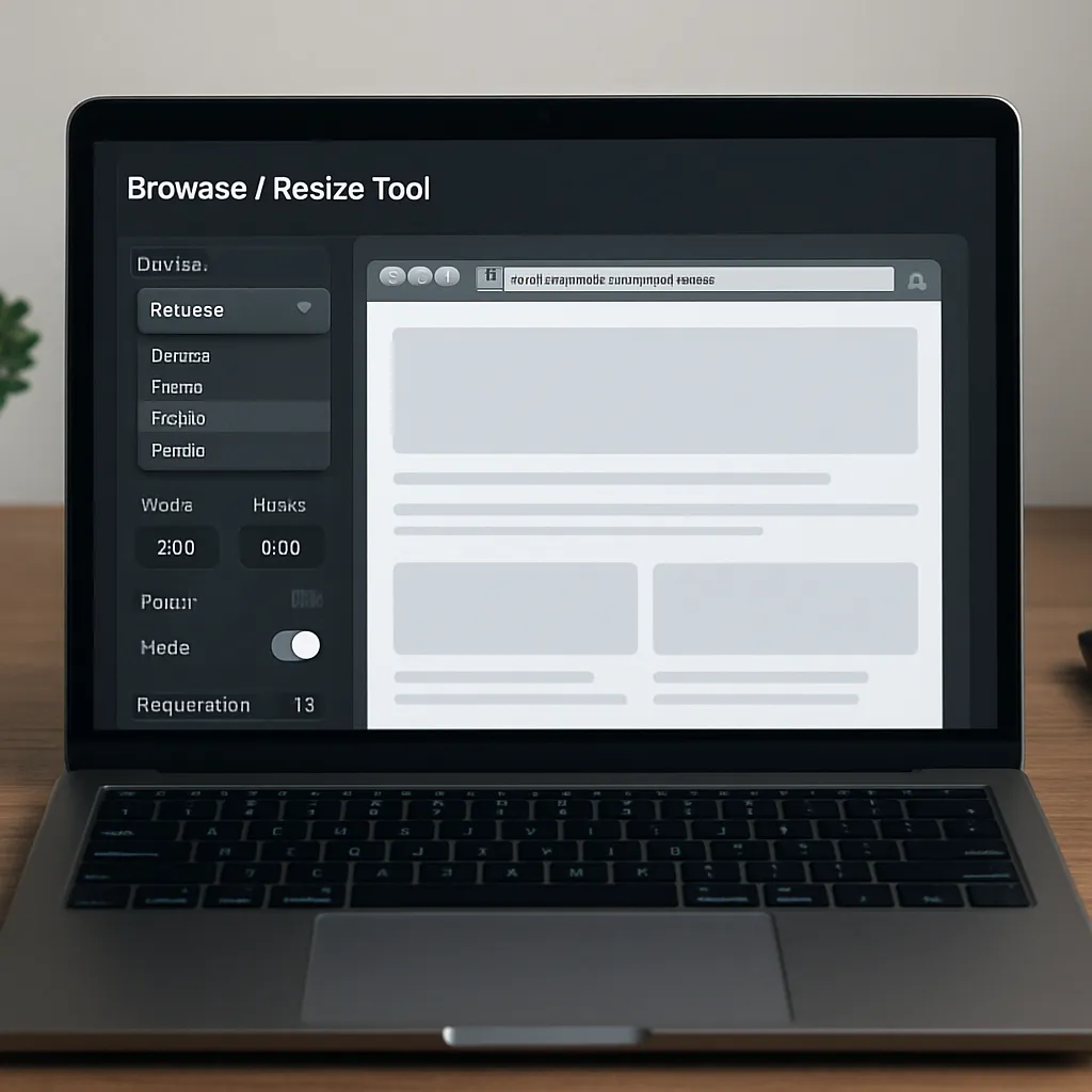
A Browser Resize Tool is usually a browser extension, online app or built‑in developer feature that lets you change the visible viewport of your browser window to predefined or custom dimensions. Unlike simple full‑screen toggles, it focuses on simulating concrete resolutions such as 1920×1080, 1366×768, 1024×768, or mobile breakpoints like 360×800, 414×896 or 768×1024. Many tools also support pixel ratio simulation, orientation switching and basic throttling of network speed.
From a technical point of view, the software sends commands to the browser to adjust width and height of the visible area. The underlying rendering engine (Chromium, Gecko, WebKit) then repaints the page according to the active CSS rules and scripts. This is crucial for exploring how responsive design behaves: which elements wrap into new lines, which menus become hamburger icons, how fonts scale, and when images are swapped for lighter versions. Because these changes are driven by the same CSS media queries that run on real devices, a well‑designed Browser Resize Tool gives a realistic preview of layout behavior.
Some advanced tools extend this core functionality with additional UX and SEO‑oriented features. They may allow simultaneous comparison of multiple resolutions side by side, screenshots for documentation, or live synchronized scrolling across various viewports. Others integrate with testing frameworks, letting teams automate checks for visual regressions or layout breaks after each deployment. All of this is accessible without leaving the browser environment, making experimentation both fast and relatively low risk.
SEO relevance: why viewport simulation matters for rankings
Search engines increasingly reward websites that provide a seamless experience across devices. Google’s mobile‑first indexing, Core Web Vitals and continuous emphasis on usability make it clear that organic rankings are no longer defined only by content and backlinks. The structure of the page, its stability on load, and interaction readiness strongly influence how algorithms evaluate quality.
A Browser Resize Tool does not directly manipulate metadata or generate backlinks, but it helps diagnose issues that harm your mobile usability and, indirectly, your rankings. By rapidly resizing the viewport, SEO specialists can validate several critical aspects:
- Whether key content is accessible without horizontal scrolling on popular mobile resolutions.
- How navigation behaves on smaller screens: are menus visible, tap targets large enough, and important categories reachable?
- Whether ads, pop‑ups and banners overlap content at specific breakpoints, risking penalties for intrusive interstitials.
- How layout shifts occur on load, which directly relates to the CLS part of Core Web Vitals.
- Whether text remains legible across devices or becomes too small when the viewport shrinks.
Because organic traffic often comes predominantly from mobile devices, neglecting these aspects results in lower engagement metrics such as time on site, pages per session and conversion rates. These user signals are monitored by search engines as proxies for relevance and satisfaction. Consistently checking layout behavior with a Browser Resize Tool helps identify elements that frustrate users: misaligned buttons, overlapping sections, or CTAs pushed below the fold on popular smartphones.
Another angle especially important for technical SEO is content parity between various viewports. While classic separate m‑dot domains are now rare, many websites still use conditional rendering, loading or hiding content depending on screen size. When a browser window is resized, SEOs can confirm whether headings, internal links, schema‑relevant elements and critical blocks of text are visible and identical on desktop and mobile. Inconsistent content can confuse crawlers and cause keyword cannibalization or missed indexing opportunities.
Practical applications for SEO specialists and web teams
In actual workflows, a Browser Resize Tool becomes a versatile instrument for audits, optimization and quality assurance. Instead of being owned only by front‑end developers, it can be actively used by SEO strategists, content managers and even project managers. Several practical applications stand out.
On‑page audits and template reviews
During a website audit, resizing the browser is one of the quickest ways to review how reusable templates behave on different devices. Blog posts, product pages, category listings and landing pages often share layout components that may break in similar ways across the site. By systematically stepping through common resolutions, issues can be detected before they accumulate into hundreds of problematic URLs.
An SEO consultant can, for example, identify that breadcrumb navigation disappears at a specific breakpoint, or that an important internal link section is pushed to the very bottom of the page on smaller screens. These observations, supported with screenshots generated by the tool, can be turned into actionable tickets for designers and developers. As a result, the site’s internal linking structure becomes more robust and evenly distributed across device types, which supports better crawling and indexation.
Conversion rate and landing page optimization
Many advertising campaigns drive users to carefully crafted landing pages. However, these pages are often initially designed on desktop monitors and later adapted to mobile screens as an afterthought. A Browser Resize Tool allows marketers to test how different viewports expose or hide key conversion elements such as forms, trust badges, benefit lists or purchase buttons.
By inspecting layout behavior just above and below the fold at different heights, you can check whether the primary call‑to‑action remains visible and accessible. If the resize reveals that the sign‑up button is pushed too far down on smaller devices, A/B tests can explore alternative layouts. Over time, this iterative process improves both user satisfaction and the efficiency of paid and organic campaigns, aligning UX improvements with measurable SEO outcomes such as better engagement metrics.
Core Web Vitals diagnostics support
While a Browser Resize Tool does not measure Core Web Vitals by itself, it helps create the context necessary for interpretation. Performance tools often report poor CLS or LCP values without visually explaining what is moving or loading slowly. By replicating the same viewport as a significant portion of the audience and watching the page load after each resize, teams can see problematic elements in action.
For example, a hero image might initially load in a small placeholder, causing nearby text to jump when the proper image is retrieved. Or a dynamic ad slot might push content down only on specific resolutions. Repeatedly resizing and reloading at these critical dimensions makes it easier to spot the real culprit behind abstract metrics and communicate the issue clearly to stakeholders. The outcome is a more informed performance optimization strategy that directly contributes to technical SEO health.
Advantages and limitations of Browser Resize Tools
The allure of these tools lies in their speed and accessibility. Without acquiring and managing a fleet of devices, teams can approximate multiple viewing conditions in seconds. However, understanding both strengths and limitations is essential for using the software responsibly in SEO workflows.
Key advantages
- Speed and iteration: Changing viewport sizes is almost instant, allowing rapid checks during content creation, design reviews or code deployments.
- Low cost: Many Browser Resize Tools are free or bundled with browser developer tools, reducing budget barriers for small SEO teams and freelancers.
- Collaboration: Screenshots and viewport presets standardize how teams discuss issues. Instead of vague descriptions, colleagues can refer to specific resolutions and captured images.
- Alignment with responsive design: Because the tool relies on the same CSS breakpoints as real devices, it gives an authentic picture of layout behavior in modern frameworks.
- Non‑intrusive workflow: SEOs can use the tool directly in their everyday browser without switching environments, which encourages more frequent checks.
Limitations and caveats
Despite their usefulness, Browser Resize Tools are not a complete replacement for physical devices or dedicated testing labs. Several limitations should be kept in mind:
- Device hardware differences: Battery life, CPU speed and GPU performance impact perceived loading speed and smoothness but are not fully simulated by simple viewport resizing.
- Touch interaction: Clicks with a mouse are not equivalent to taps, swipes and multi‑touch gestures. Testing mobile navigation requires at least occasional checks on real smartphones and tablets.
- Operating system nuances: Rendering differences between Android, iOS, Windows and macOS can influence typography, scroll behavior or native UI elements.
- Network variability: While some tools allow basic throttling, they often do not reflect unstable mobile connections or high‑latency conditions that affect real users.
From an SEO standpoint, this means that a Browser Resize Tool should be part of a broader testing strategy. It excels at quickly finding obvious layout issues and content placement problems, but results must be validated against real‑world data such as Google Search Console mobile usability reports, PageSpeed Insights metrics and field data from analytics platforms.
Opinion: does a Browser Resize Tool truly help with SEO?
Evaluating the SEO value of Browser Resize Tools requires distinguishing between direct ranking factors and enabling capabilities. The software itself does not appear in the eyes of search engines; no crawler awards points for having used a particular extension or app. However, by revealing layout problems early and often, these tools enable faster corrections that improve mobile friendliness, usability and performance.
In practice, teams that regularly integrate viewport checks into their optimization cycles tend to deliver more coherent experiences across devices. Navigation remains clean, internal links stay accessible, and key content is not hidden behind awkward scrolling or misaligned modules. These qualitative improvements, while small on their own, accumulate into better user metrics. Lower bounce rates, longer sessions and higher conversions send positive signals to algorithms that rely on behavioral data to refine rankings.
Another aspect is communication within multidisciplinary teams. SEO insights often struggle to influence design and development decisions due to abstract terminology. A Browser Resize Tool provides concrete visuals: screenshots of broken layouts at specific resolutions carry more persuasive power than generic recommendations. When stakeholders clearly see, for example, a checkout button disappearing on mid‑range mobiles, they are more likely to prioritize fixes that also benefit organic traffic.
From this perspective, the software acts as a bridge between analytics, design and code. It transforms theoretical SEO recommendations into tangible UI changes that can be quickly verified. This accelerates feedback loops and can shorten the time between discovering an issue and deploying a remedy. For competitive industries where ranking fluctuations translate directly into revenue, such agility becomes a strategic advantage.
At the same time, overreliance on resize simulations alone can create a false sense of security. Without validating against actual hardware or synthetic mobile testing platforms, teams may miss nuanced problems such as system font differences, gesture handling bugs or browser‑specific rendering quirks. Therefore, an informed opinion is that Browser Resize Tools are highly beneficial as a first line of defense and ongoing monitoring mechanism, but not the final authority on mobile SEO quality.
Interesting features and best practices when choosing a tool
The market offers a variety of Browser Resize Tools, from minimalistic extensions to comprehensive testing suites. When selecting one for SEO‑oriented work, certain features and practices increase the overall value.
Custom preset management
Being able to define and save custom viewport presets is essential. Instead of relying only on generic resolutions, teams can match dimensions extracted from analytics data, focusing on the exact widths and heights used by their most common visitors. Over time, this data‑driven approach ensures that layout checks prioritize genuinely impactful configurations rather than arbitrary standards.
Side‑by‑side comparison modes
Some tools let you open multiple synchronized viewports simultaneously. This is particularly useful when comparing mobile versus desktop layout for the same URL or when reviewing different breakpoints in real time. By scrolling all views together, discrepancies in content visibility and navigation become immediately apparent. For SEO, this quickly reveals whether headings, internal links and calls‑to‑action are consistently emphasized across device classes.
Screenshot and annotation capabilities
Effective communication of findings is as important as detection. Tools that offer one‑click screenshots with dimensions overlaid reduce documentation effort. If basic annotation is included, SEOs can highlight problematic areas directly in the image. These annotated screenshots can then appear in audit documents, bug trackers or client reports, making it easier to align expectations around necessary fixes.
Integration with developer tools and workflows
For teams working in agile environments, integration with existing developer tools is a strong asset. A Browser Resize Tool that plays well with browser DevTools, debugging consoles and CI/CD pipelines supports a smoother handoff from problem detection to code changes. Automated tests can include visual checks at specific resolutions, helping prevent regressions that reintroduce previously fixed layout issues.
Regardless of which specific product is chosen, certain best practices maximize effectiveness:
- Base preset resolutions on analytics data, not assumptions about users.
- Document and track issues revealed by resizing in a centralized ticket system.
- Combine resize checks with performance audits focused on mobile users.
- Periodically validate simulated results against physical devices and external testing platforms.
Conclusion: role of Browser Resize Tools in a modern SEO stack
A well‑chosen Browser Resize Tool fills a precise yet influential niche in the SEO toolkit. It is not a keyword research platform, backlink analyzer or content optimization engine, but rather a diagnostic lens that shows how real users encounter your pages on diverse screens. By making responsive behavior fully visible, it helps teams align design decisions with search engine expectations and user needs.
Used thoughtfully, this software tightens feedback loops between analytics, UX and development. Layout problems that might otherwise remain hidden become visible and fixable. As a result, websites can better support mobile‑first indexing, achieve healthier Core Web Vitals, and deliver coherent experiences that foster engagement. The value does not lie in the tool itself, but in the disciplined habit of examining how content is presented at the viewports that matter most.
For organizations serious about organic search performance, incorporating a Browser Resize Tool into regular review cycles is a pragmatic step. It demands little investment, integrates smoothly into existing browsers, and yields insights that are immediately actionable. While it should never replace real‑device testing or holistic UX research, its contribution to day‑to‑day SEO work is substantial enough to justify a place alongside more traditional analytics and optimization platforms.